Patras Events
Branding, logo design
Patrasevents.gr is a portal about local entertainment and cultural events in Patras. I was invited to develop the visual identity and design the logo. Eventually the client rejected the project.
Initial approaches
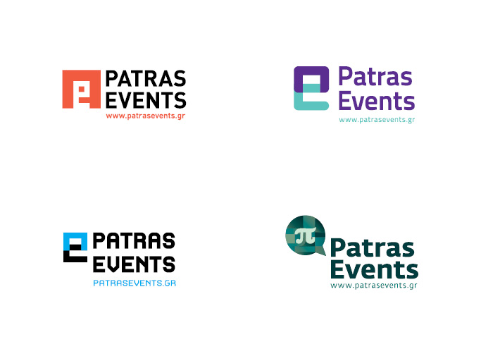
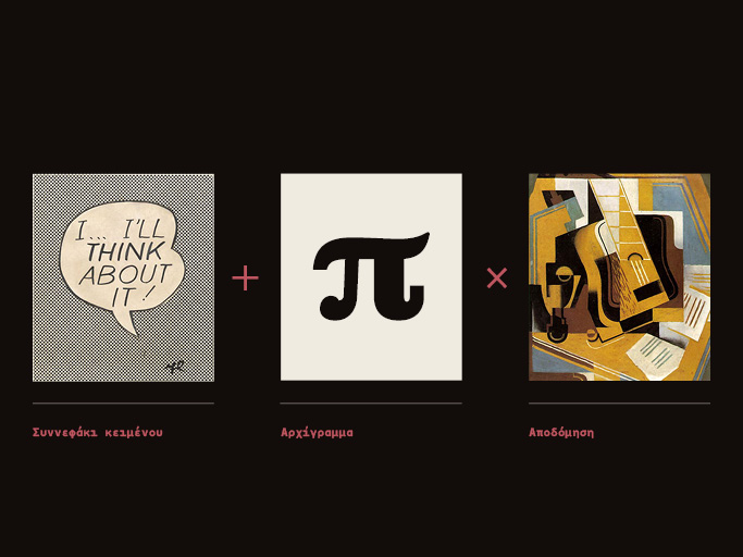
Idea
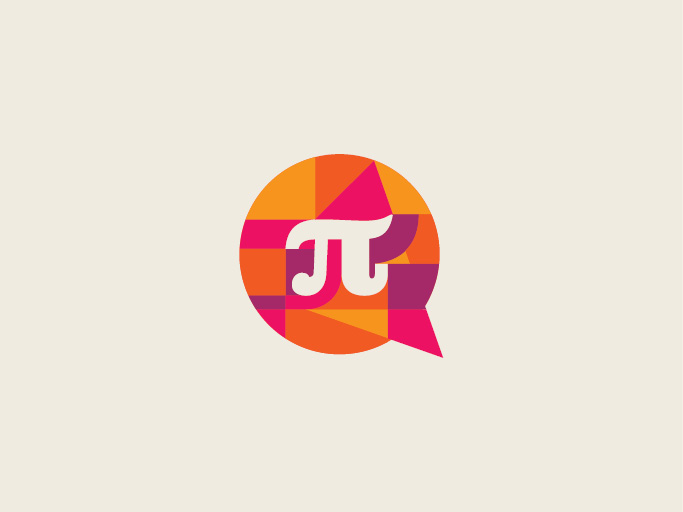
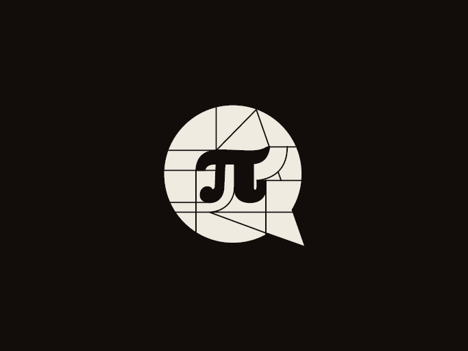
The idea is based on three elements. The combination of the speech bubble and the monogram, using deconstruction as a medium to create a visual vocabulary.
Typography
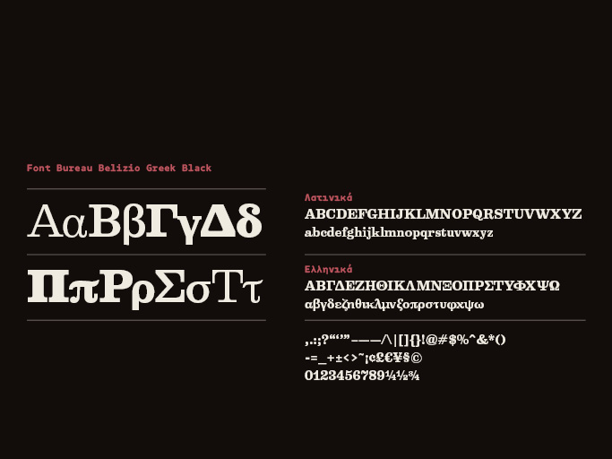
The main typeface is Belizio Greek by Font Bureau, a tribute to Haas Clarendon, used for its boldness and timelessness.
Icon development
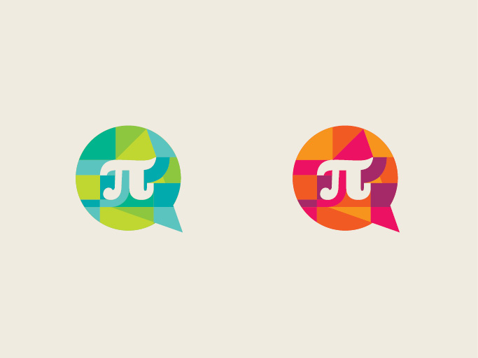
The monogram is set inside the speech bubble, and a geometric grid is built using deconstruction of the negative space.

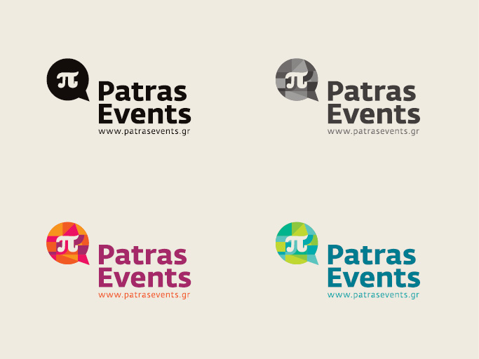
Monochrome
The grid is inverted and the negative space now defines the shapes of the logo.
Proportions
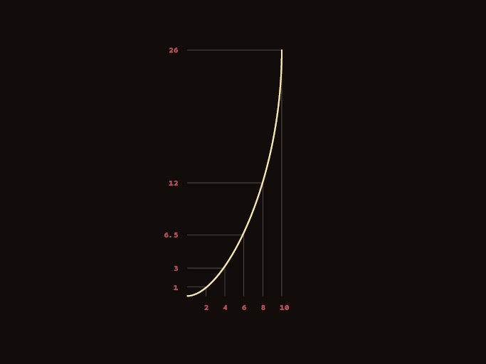
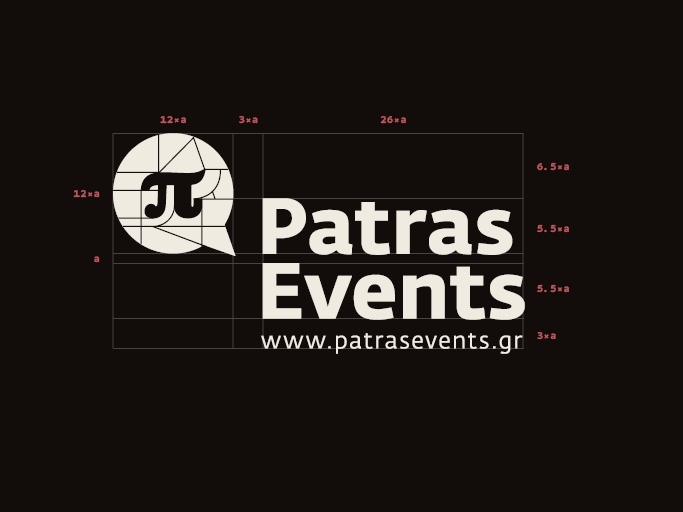
Using a smooth curve, I introduced a scale which I applied to the logo and the sign proportions.
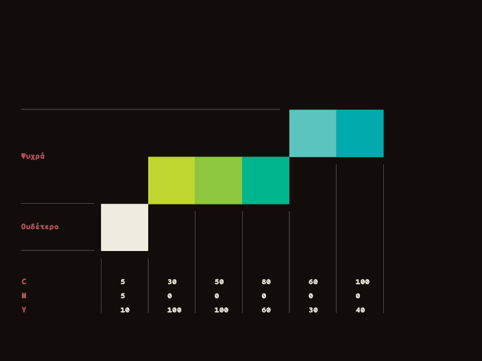
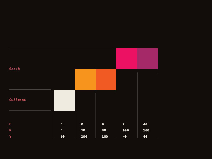
Colors
A palette of five tones was used to separate the shapes, and two color schemes (warm/cold) were proposed.