Polytropo
Branding, logo design
Michael Cacoyannis Foundation's Cultural Centre
School project created in 2010. The assignment was to design a brand and develop a visual identity for the cultural centre. I eventually dropped the course after a while because the tutor rejected all of my proposals.
The Foundation
Michael Cacoyannis (1922–2011) was a prominent Greek Cypriot filmmaker, best known for his 1964 film "Zorba the Greek". His ambition was the creation of a modern cultural institution with its own distinctive identity, which would engage in the study, support and promotion of the Performing Arts, particularly Theatre and Cinema.
The Cultural Centre
With a modern infrastructure and covering a total area of 6.810 square meters, home to the MCF’s cultural programme since October 2009, the new building is capable of hosting a multitude of different events – corporate conferences, seminars, presentations, exhibitions etc.
Its four floors include an amphitheatre, a cinema, a multi-use black box hall and exhibition areas. There are also two café-bars, as well as a penthouse bar-restaurant.
The project
I wanted to design a logo that represents the modernism and openness of the foundation, as well as the simplicity and the visual/cinematic boldness in Cacoyannis' films. The greek word "Polytropo", from "poly / πολύ" (many / multi) and "tropos / τρόπος" (way / mode) conveys the centre's multidisciplinary purpose. The main inspiration was the 60s modernism in graphic design. The era corresponds with Cacoyannis' most important works, and the aesthetics (geometric forms, black/white/red colors) are accordingly to the attributes of his films.
Colors
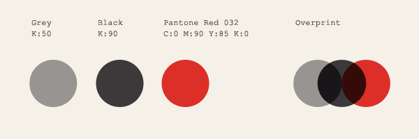
Three colors overprinted on off-white background.
Typography
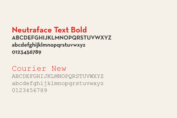
Richard Neutra's lettering was open and unobtrusive, the same characteristics which typified his progressive architecture. Without sacrificing warmth and human feel, Neutraface remains true to the International (Typographic) Style, a movement that emerged the same time as Cacoyannis' work.
Courier New as a complement to Neutraface offers a more technical aspect and a relevant context, dating from the same era, and being widely used as a screenplay typeface.
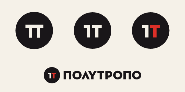
Approach 1: Π/Τ
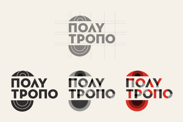
The symbol is a combination of the initials of the two words (Π/Τ). By dividing vertically the letter Π (pi), the letter T emerges.
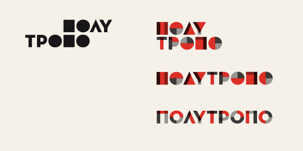
Approach 2: Modular type
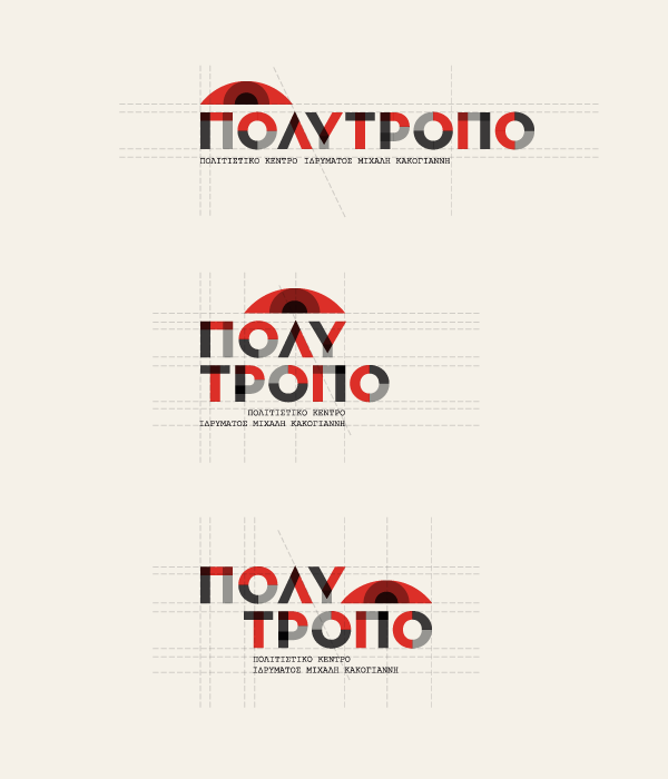
The type is stylized into colored rectangles and circles, conveying the brand's multidisciplinary nature. But the legibility seems to suffer.
Approach 3: Icon
The basic geometric modules are used to form the icon. The camera is too specific and does not relate with the brief. On the other hand, the eye and the amphitheatre are more generic, both similar in shape, and more related with the visual / theatrical / cinematic aspect of the foundation.

Final proposal
Grid, monochrome, grayscale and color versions
